Power BI Custom Visual (Bar and Line Chart with Table)
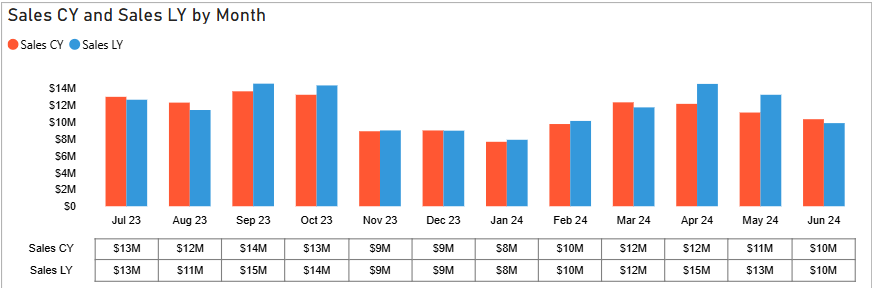
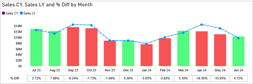
This MICROSOFT CERTIFIED Power BI custom visual combines a bar and line chart with an integrated table, providing a comprehensive view of your data in a single visual. It's FREE and ideal for visualizing trends and relationships between different metrics while also displaying the underlying data in a tabular format for detailed analysis. Since it's Microsoft Certified, you can trust this visual to be SAFE AND SECURE - it does not store or transmit your data.
Details
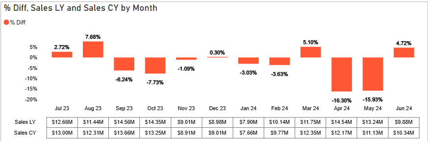
- Presents different metrics on a single chart (using bars and lines) for easy comparison and correlation analysis
- Includes a table beneath the chart displaying the source data, enabling detailed value examination and deeper analysis
- Offers interactive chart and table elements with formatting options such as conditional formatting, dynamic axis, etc
- Provides options to customize the chart and table's colors, fonts, and overall style to align with your report's design
- Supports a variety of metrics and dimensions from your Power BI data model
- Find more details including the source code in my GitHub repository
Tools & Technologies
- Power BI, TypeScript
How to use
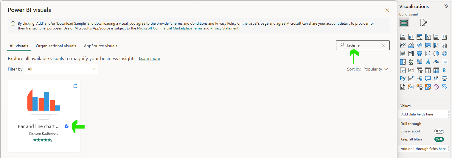
To import the visual into Power BI from Power Appstore,
- Search my name Kishore Kadhirvelu in the search bar (or)
- Search the visual name Bar and line chart with table in the search bar
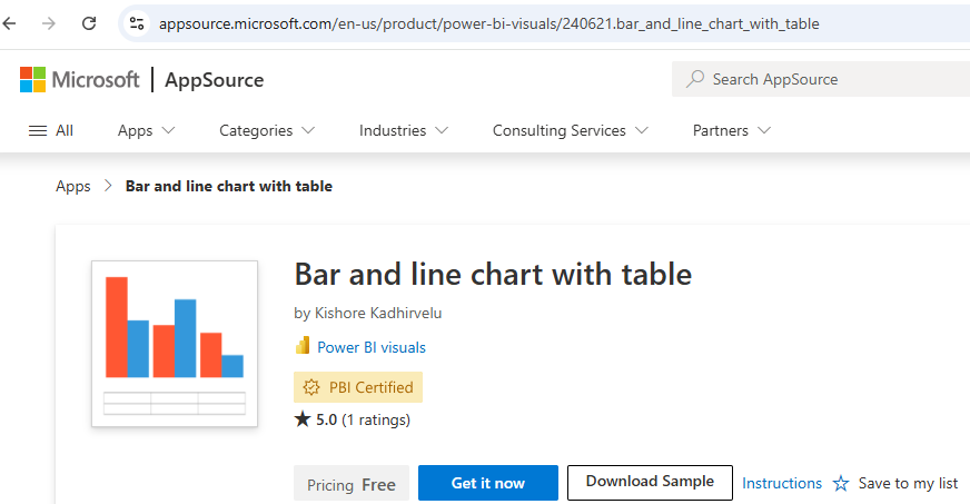
You can also download it from the Appsource and import it into Power BI